Ubisoft Talks
A selection of corporate talks I gave about UX in video games
A selection of corporate talks I gave about UX in video games
I have had the privilege of sharing my knowledge about UX design and video-games while representing my company. These talks were presented to different audiences within and outside Ubisoft.
Whereas nowadays UX is largely known and embedded within organizations, it is still a misunderstood field, and I am committed to teaching and spreading the word about my profession.
I gave a talk for employees about UX in gaming.
I participated in a live interview conducted by a Twitch journalist. The audience was mainly young students. I talked about how to become a UX in the game industry.
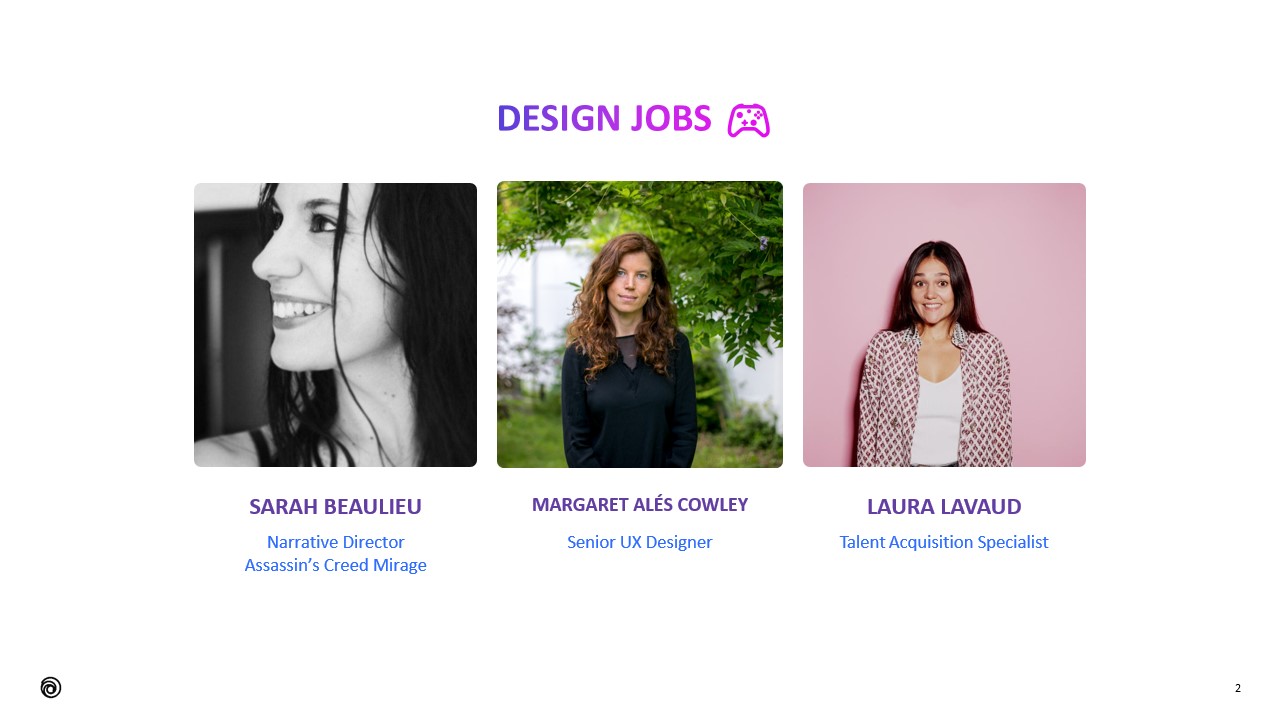
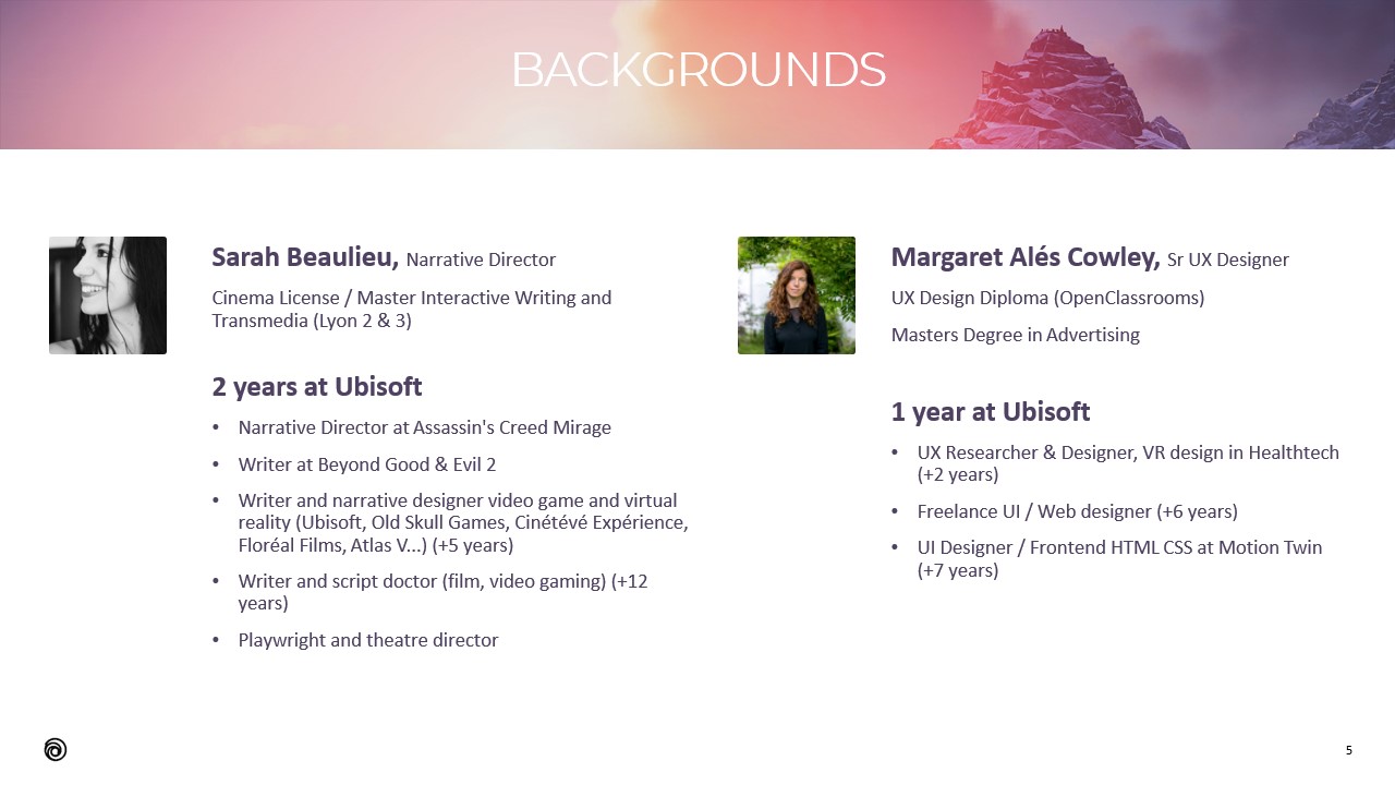
I co-presented a talk about design with Sarah Beaulieu (Narrative Director in Assassin's Creed Mirage).
This talk was presented to employees of Ubisoft Bordeaux in November 2021.
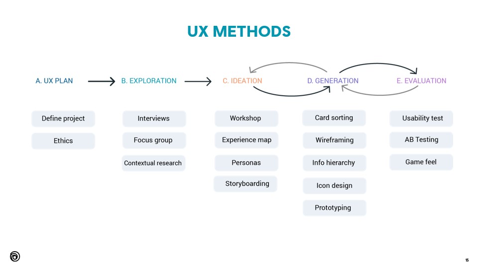
The presentation starts with generic and theoretical principles about UX, and it finishes by diving into details and practical examples in video-games.

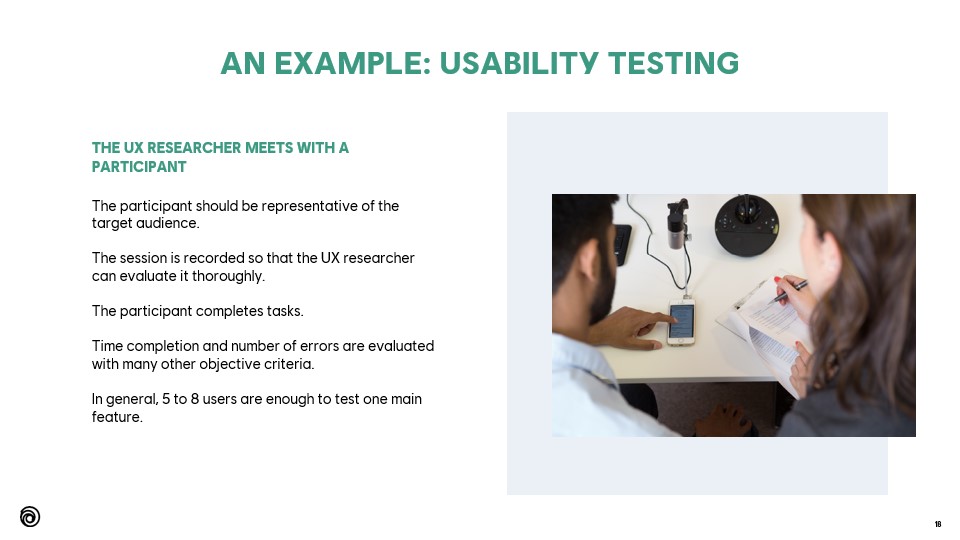
On this slide, I explain the value of testing early and gathering data from external players.
I keep seeing creatives and producers tempted to wait until the game is quite advanced, whereas that is exactly what should be avoided.
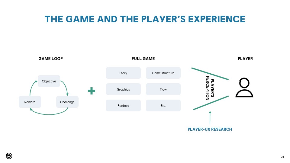
AAA games are complex, but the essence is still the same. The core game loop and 3Cs must be tested by external, non-biased target players before adding depth. Focused user research is entirely possible.
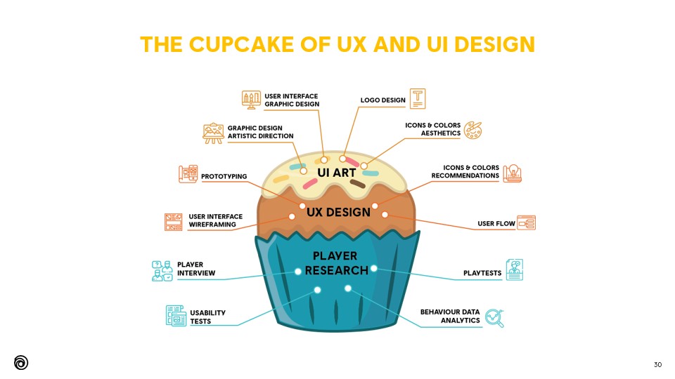
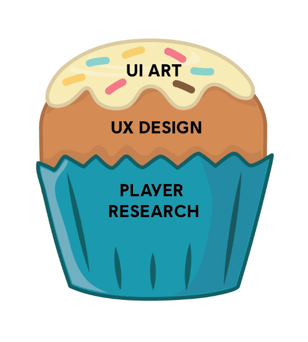
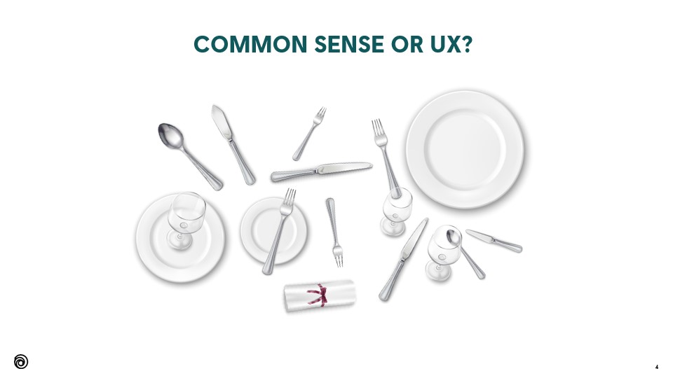
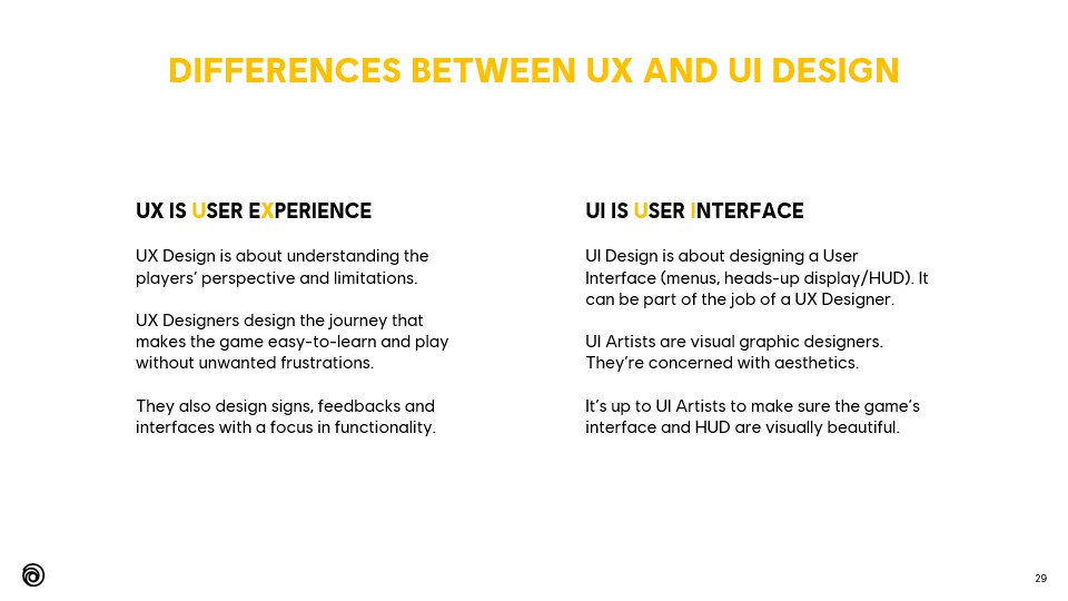
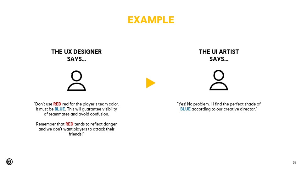
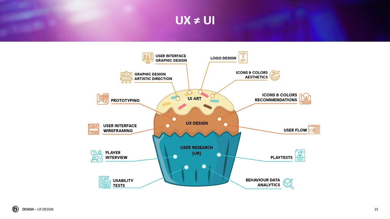
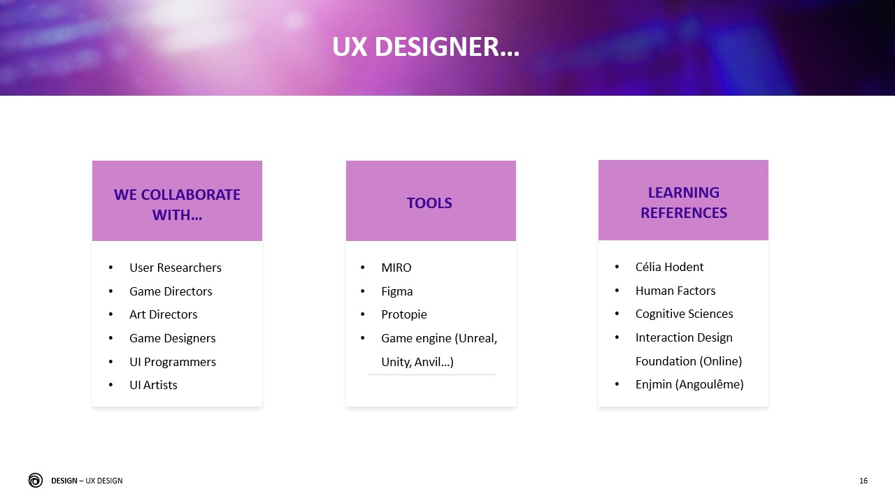
This is the eternal million-dollar question, especially since hiring a single “UI/UX Designer” position is still the norm.
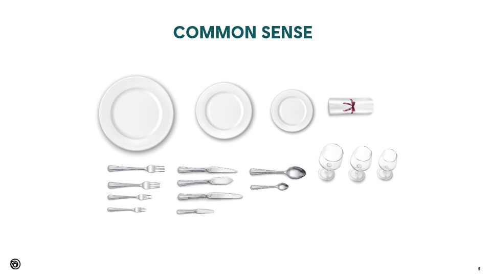
I have personally made the choice to evolve from UI to UX and not to combine both as opposed to a UI Designer who would focus on Art Direction. In a nutshell:
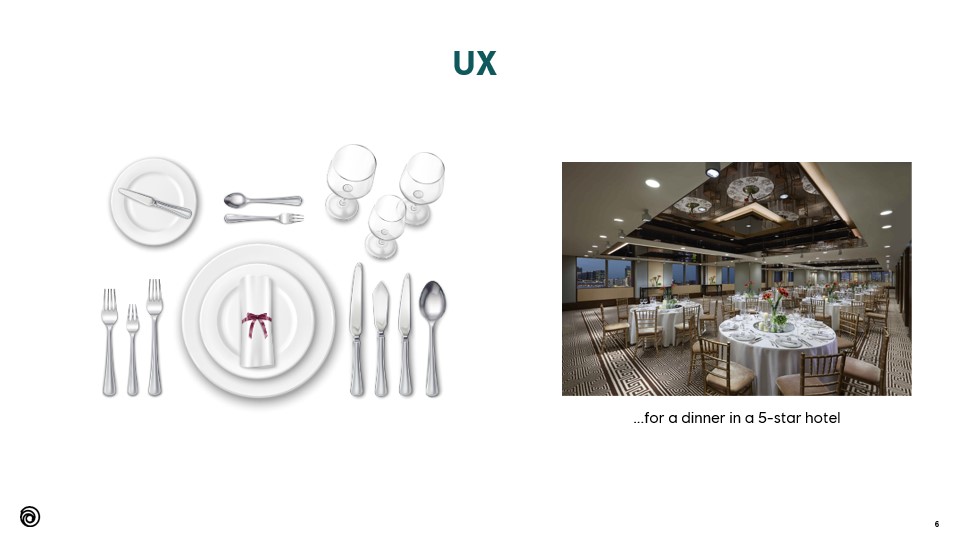
Depending on the scope and the size of the studio, producers can look for a single person that would do both, but ideally both specialties should remain separate and collaborate closely together.
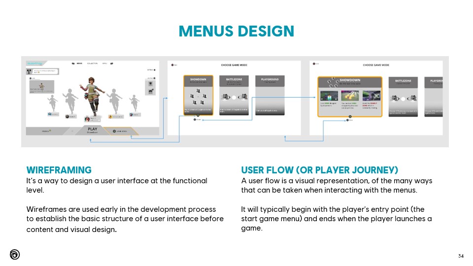
On this slide, I show a few simple and basic wireframes I designed for a specific player journey.
Wireframing and its associated specs are the typical basic deliverables for a UX Designer.
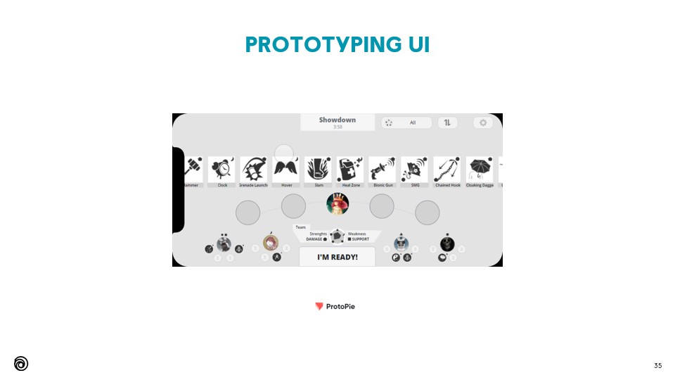
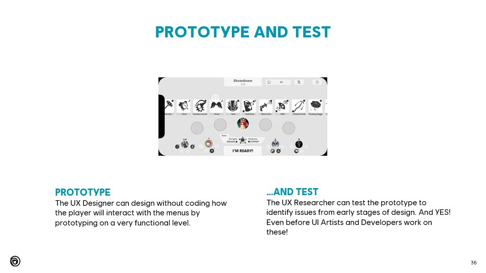
Example of a functional prototype on a mobile phone device. I designed and tested this prototype as part of a full player journey wireflow.
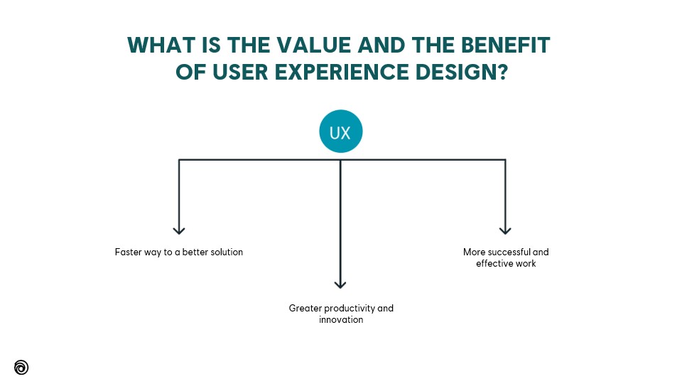


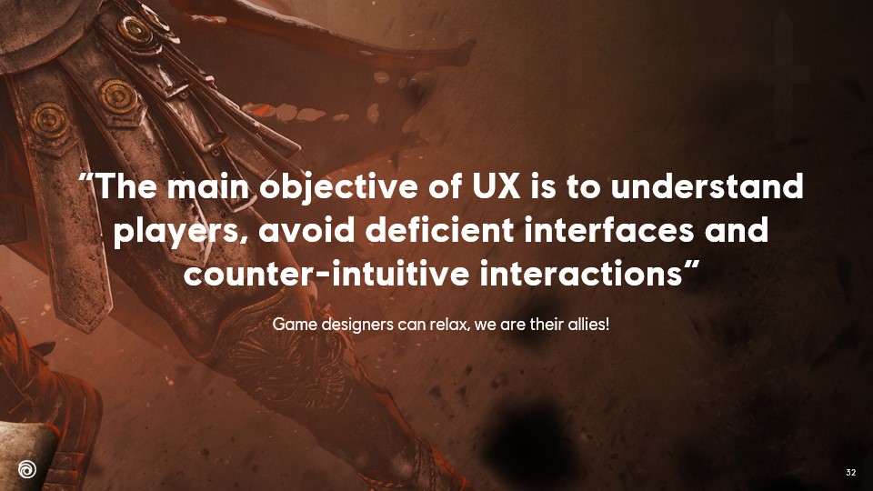
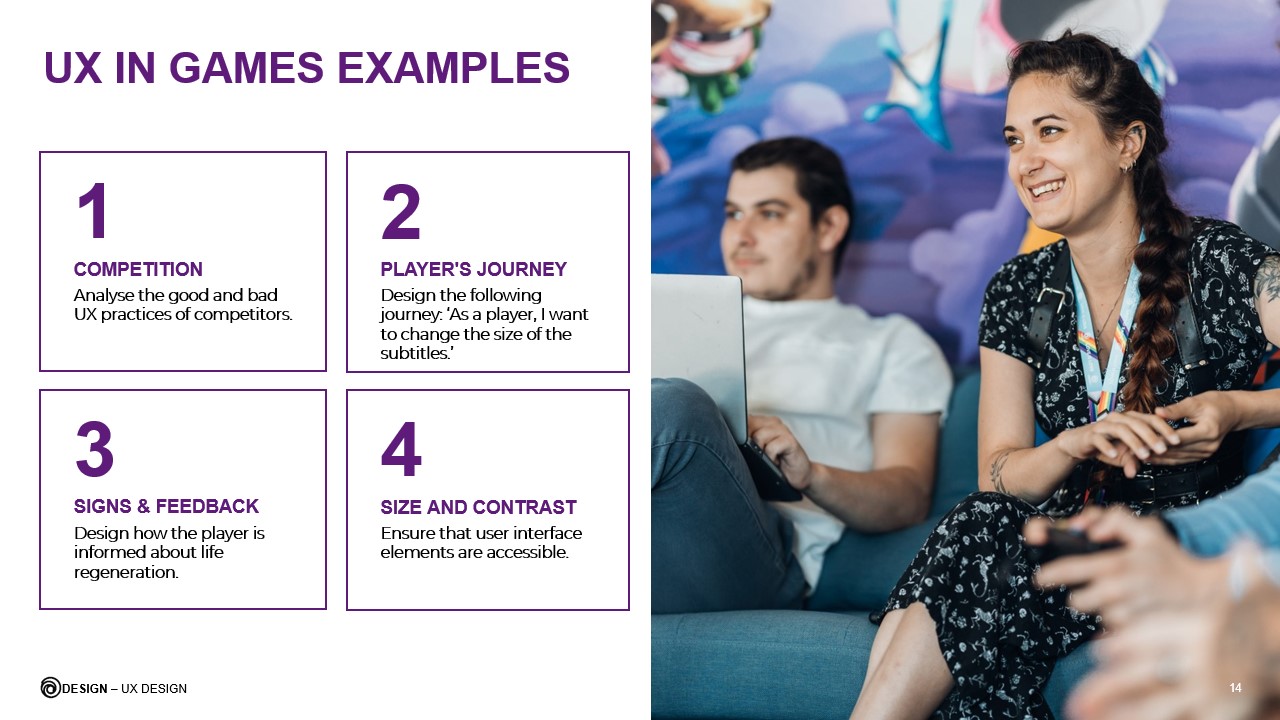
The main objective of UX is to understand players, avoid deficient interfaces and counter-intuitive interactions (slide 32)
This was my first talk at Ubisoft and I genuinely enjoyed giving this presentation to my colleagues 🙂
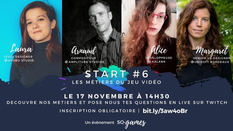
This interview (in French) was organized by So Games, a professional association for video games in Southwest France.
The idea behind this 20-minute interview was to introduce students to different video game specializations. The audience was asking questions on Twitch in real-time. I had a great time doing this interview and I hope it helped young people in their professional aspirations.
I co-presented a talk about design in video games with Sarah Beaulieu (Narrative Director in Assassin’s Creed Mirage).
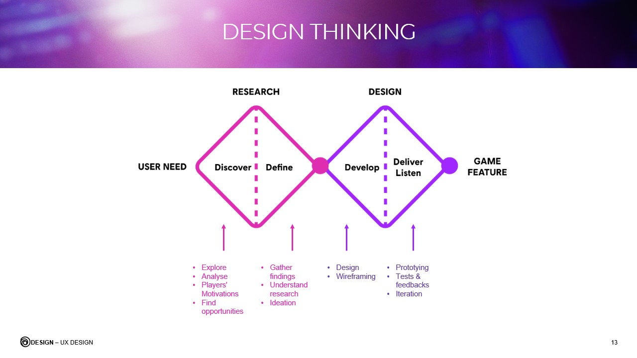
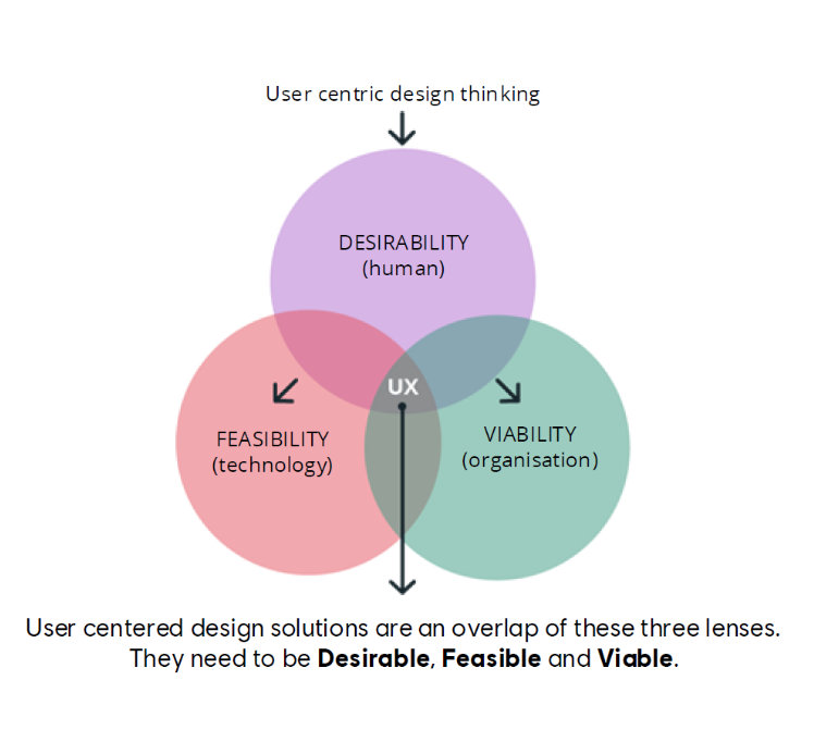
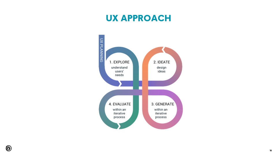
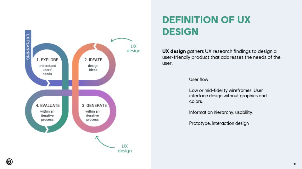
On this slide, I explain how to apply the design thinking process to video game development.
The “user need” has to be considered differently, since the game is a creative project at its core, and not a service.
In big companies like Ubisoft, the “user need” can be matched during early testing with the target audience, along with focus groups and marketing studies.

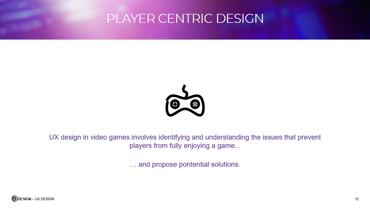
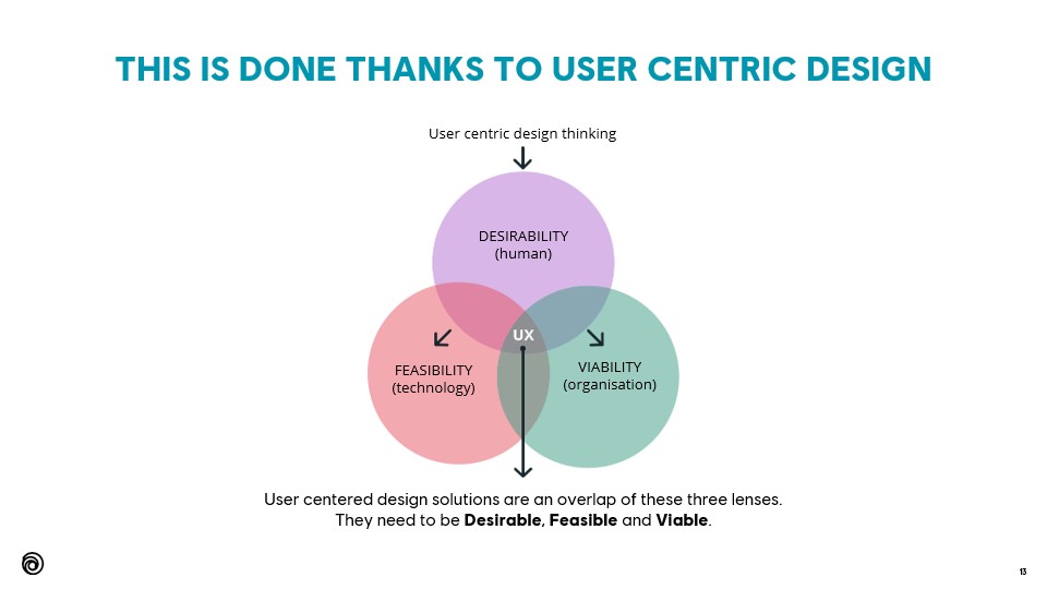
UX design in video games involves identifying and understanding the issues that prevent players from fully enjoying a game... And propose potential solutions (slide 12).
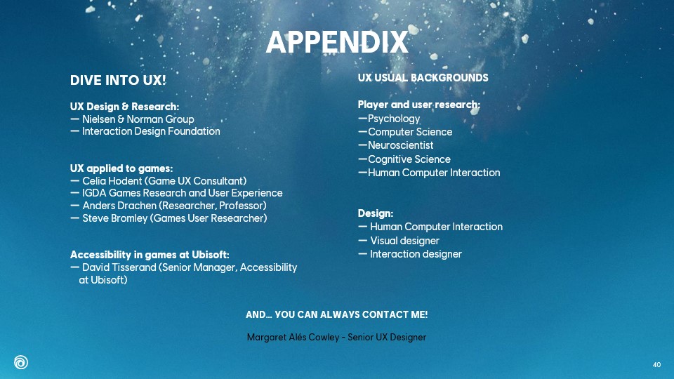
Are you a Game Designer, UX Designer or passionate gamer? Contact me to exchange and share your opinion!