Sharing my knowledge

I have had the privilege of sharing my knowledge about UX design and video-games while representing my company. These talks were presented to young students, women and Ubisoft employees.

Whereas nowadays UX is largely known and embedded within organizations, it is still a misunderstood field, and I am committed to teaching and spreading the word about my profession.

1. UX for non UX Designers

I gave a talk for employees about UX in gaming.

2. Twitch live interview

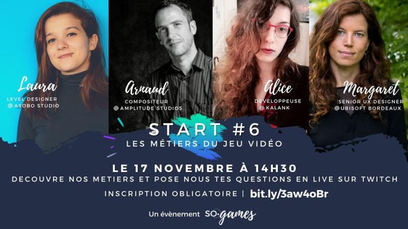
I participated in a live interview conducted by a Twitch journalist. The audience was mainly young students. I talked about how to become a UX in the game industry.

3. Womens Day

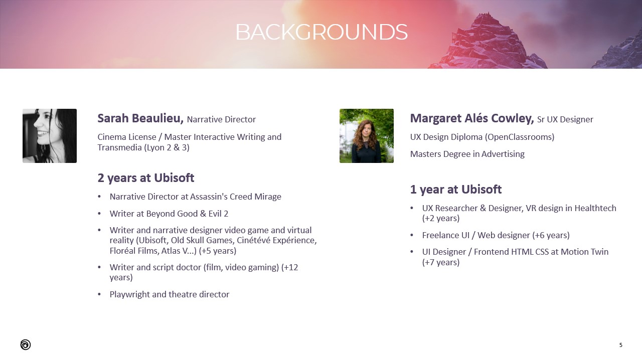
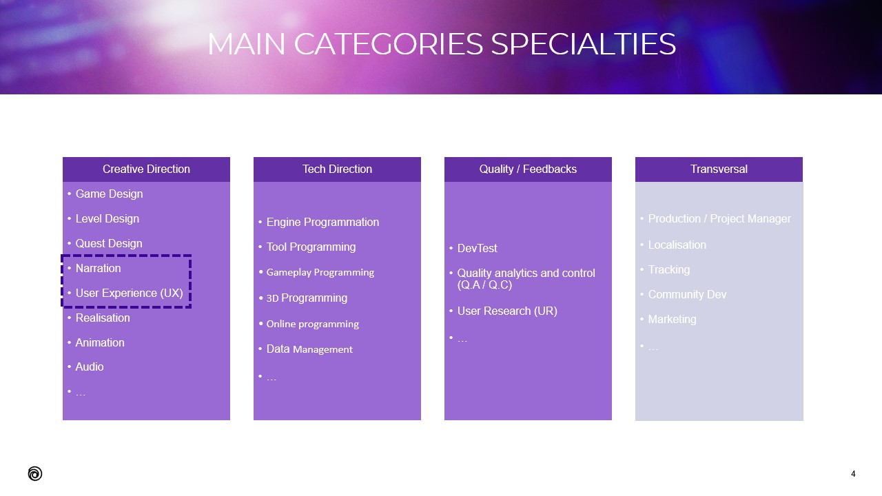
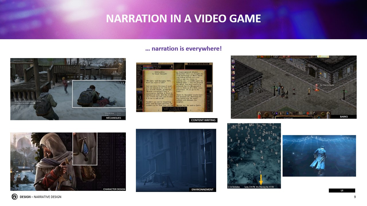
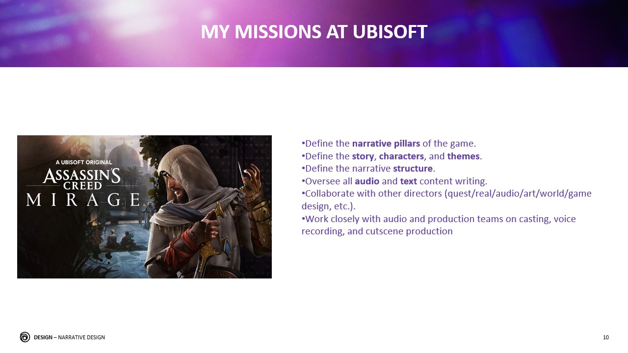
I co-presented a talk about design with Sarah Beaulieu (Narrative Director in Assassin's Creed Mirage) for women interested in the gaming industry.

1. UX for non UX Designers

ABOUT THIS TALK

This talk was presented to employees of Ubisoft Bordeaux in November 2021.

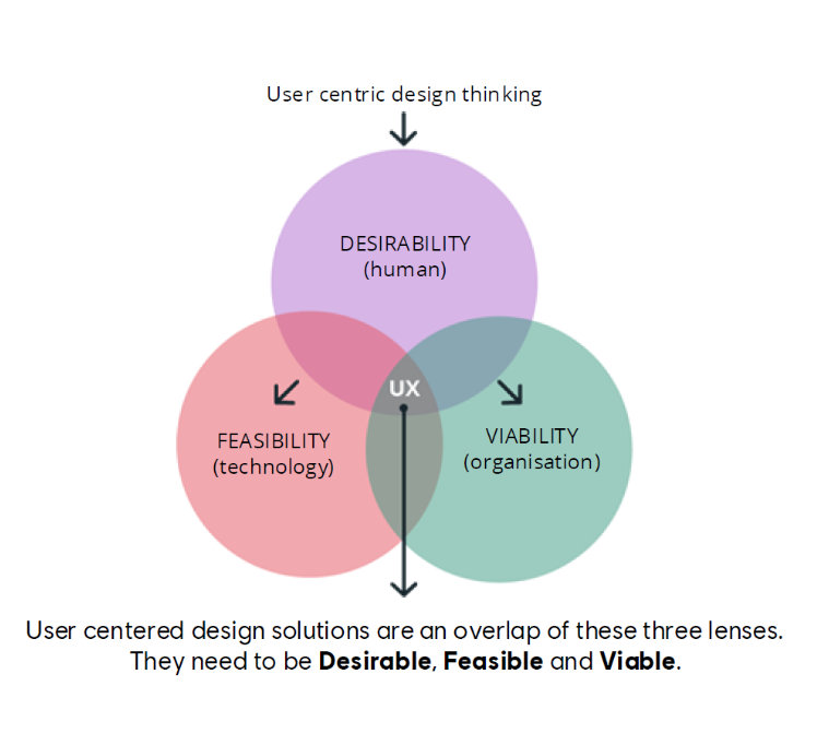
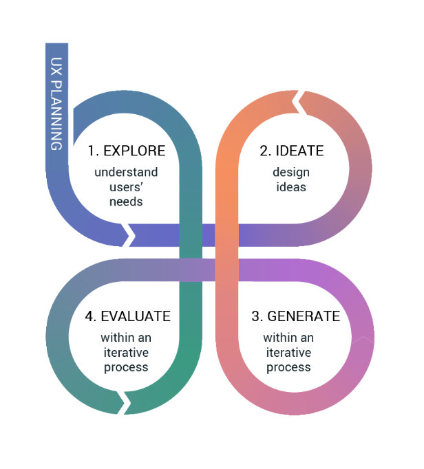
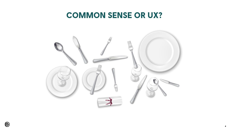
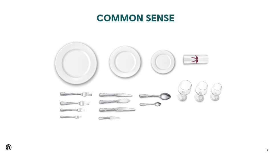
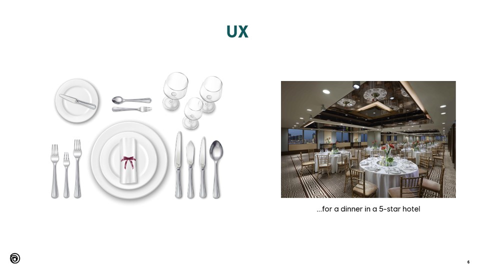
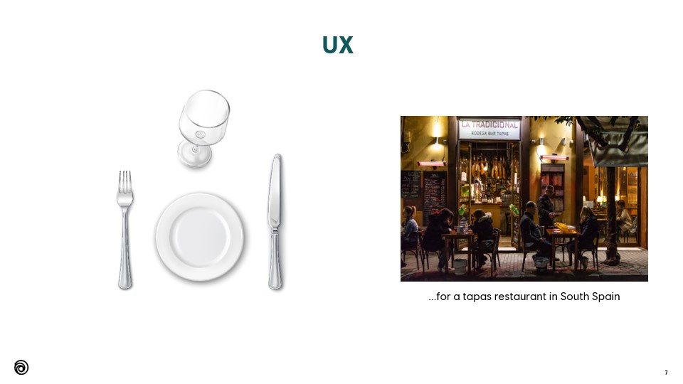
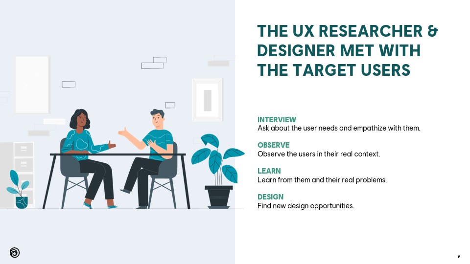
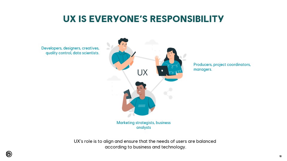
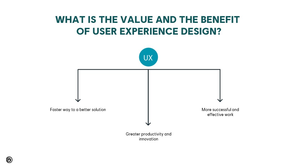
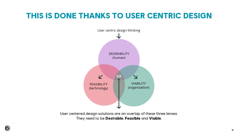
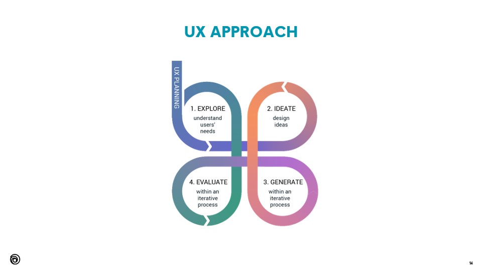
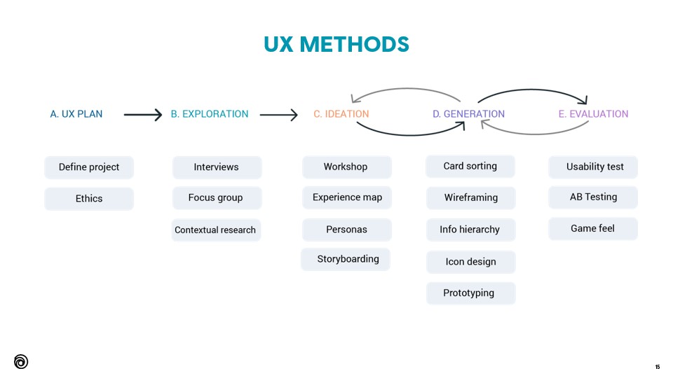
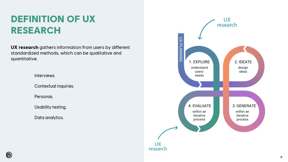
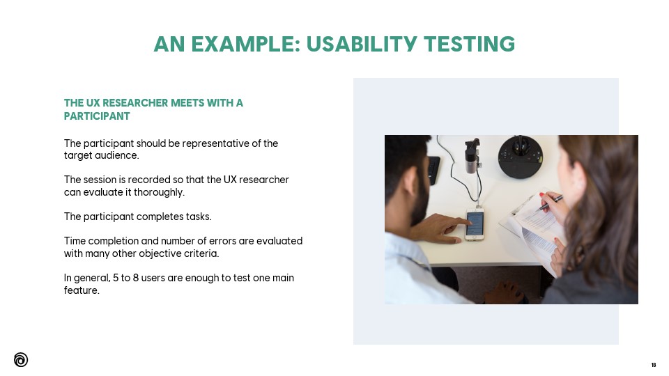
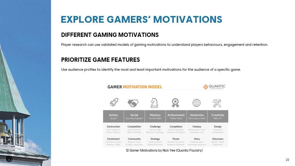
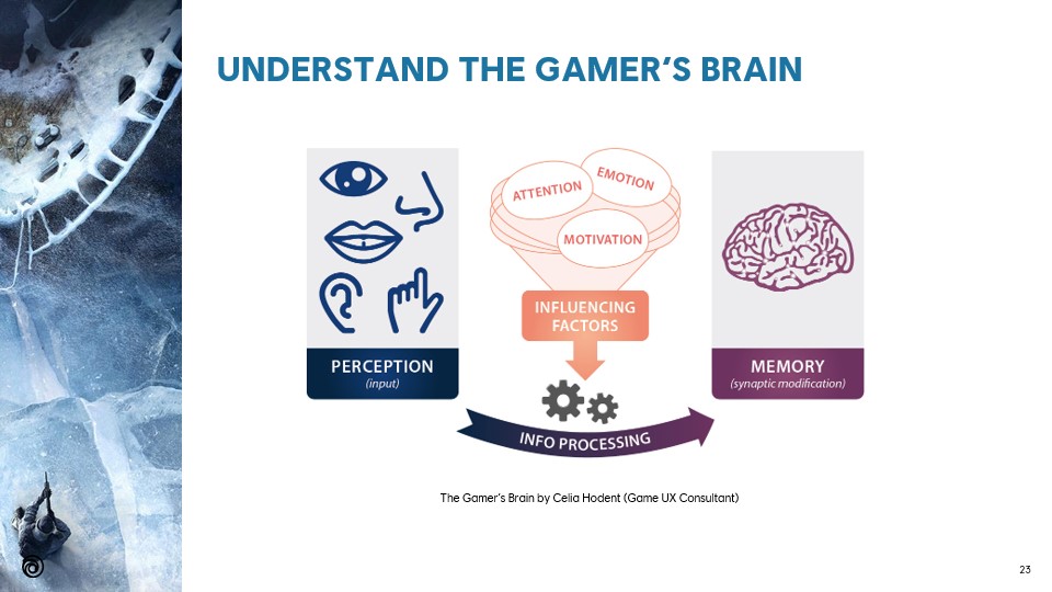
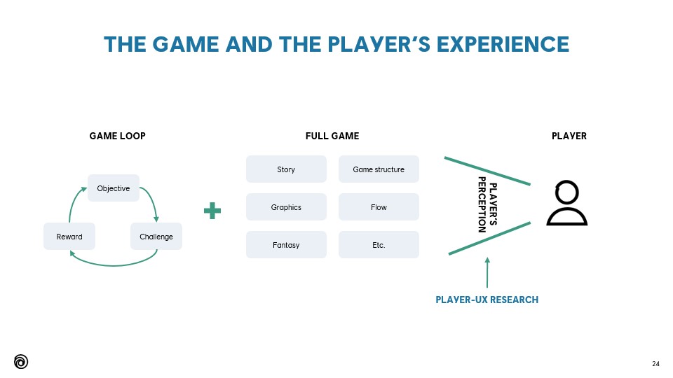
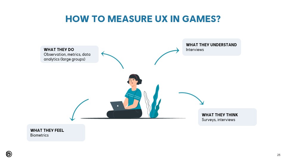
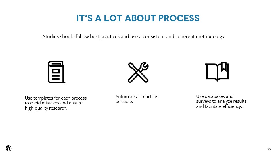
The presentation starts with generic and theoretical principles about UX, and it finishes by diving into details and practical examples.

Highlights

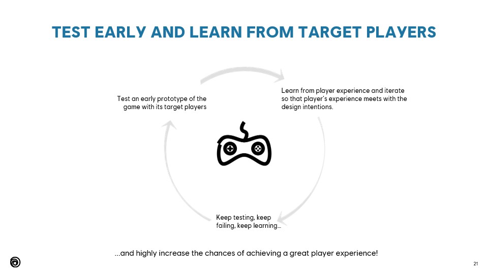
the value of testing early

On this slide, I explain the value of testing early and gathering data from external players.

I keep seeing creatives and producers tempted to wait until the game is quite advanced, whereas that is exactly what should be avoided.

AAA games are complex, but the essence is still the same. The core game loop and 3Cs must be tested by external, non-biased target players before adding depth. Focused user research is entirely possible.

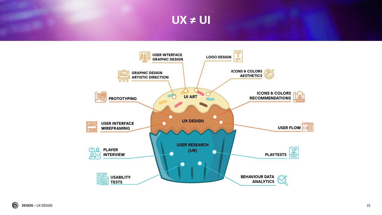
Difference between UX and UI design

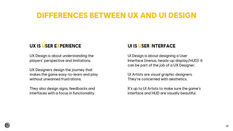
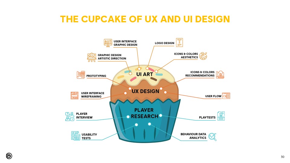
This is the eternal million-dollar question, especially since hiring a single “UI/UX Designers” position is still the norm.

I have personally made the choice to evolve from UI to UX and not to combine both. In a nutshell:

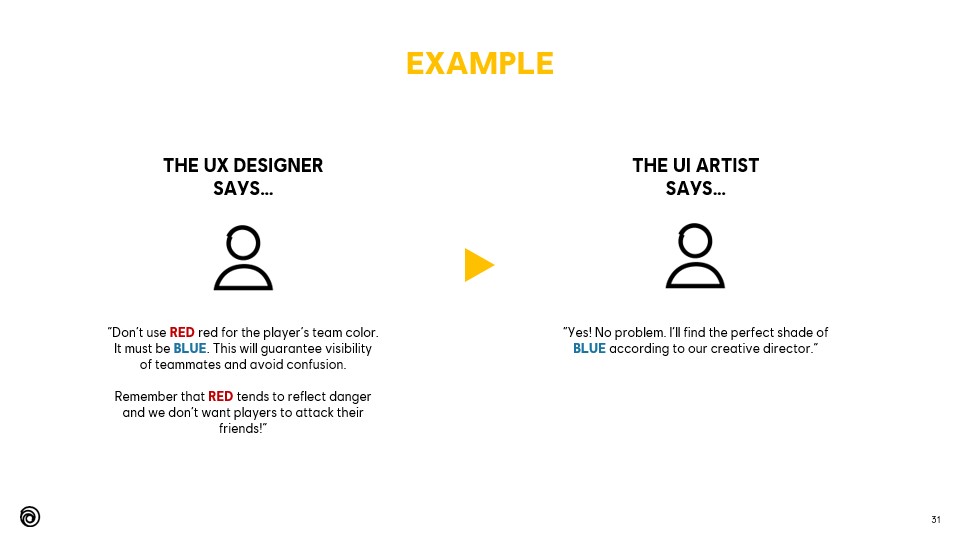
  • UX focus on functionality and the player’s perception.
  • UI Designers or Artists make sure that the interface and the HUD are visually aesthetic.

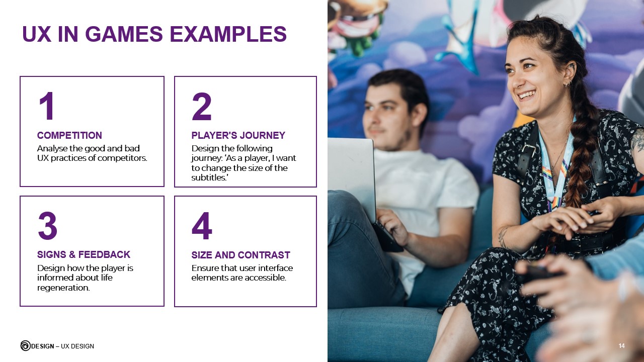
Examples of ux design applied to game design

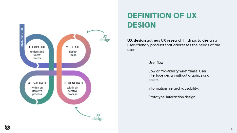
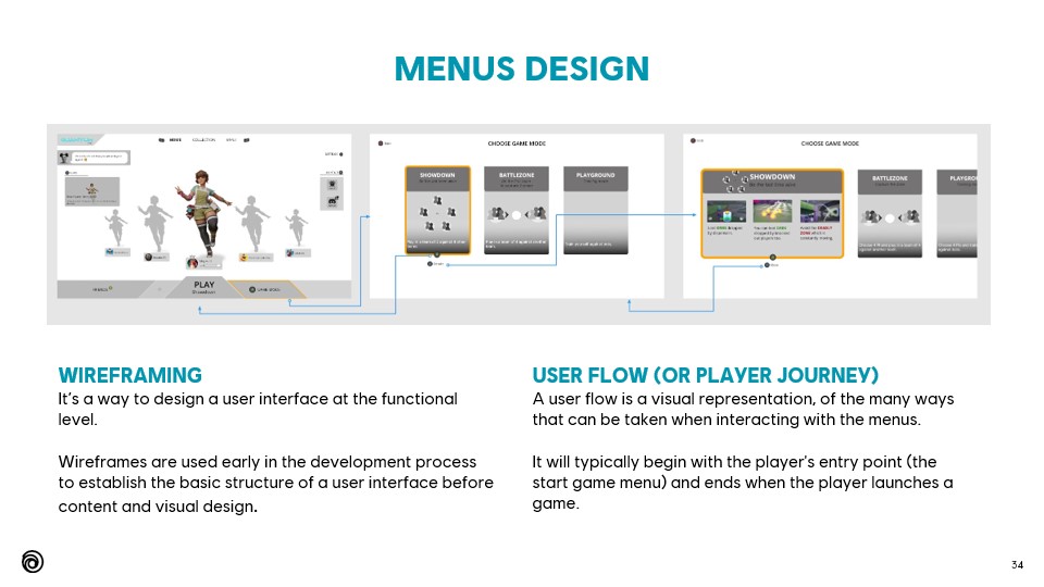
On this slide, I show a few simple and basic wireframes I designed for a specific player journey.

Wireframing and its associated specs are the typical basic deliverables for a UX Designer.

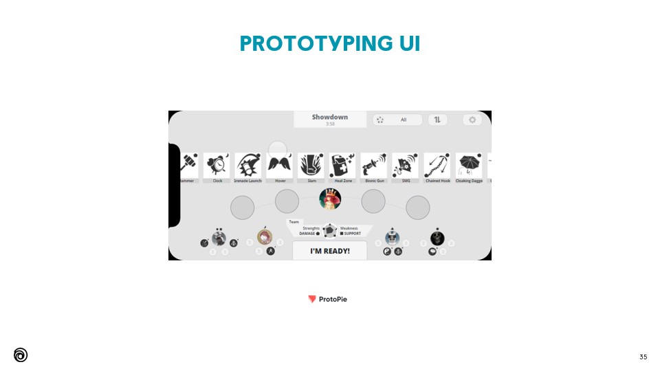
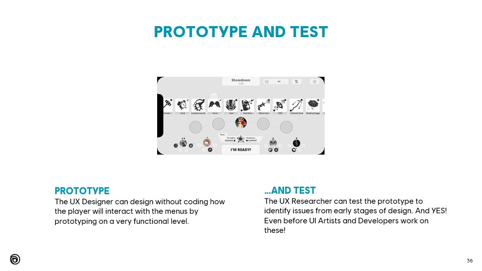
This interactive prototype was showcased during the talk:

Example of a functional prototype on a mobile phone device. I designed and tested this prototype as part of a full player journey wireflow. 
Full contents

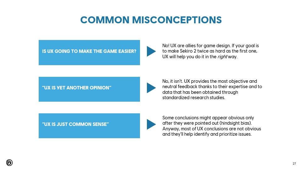
The main objective of UX is to understand players, avoid deficient interfaces and counter-intuitive interactions (slide 32)

This was my first talk at Ubisoft and I genuinely enjoyed giving this presentation to my colleagues 🙂 

2. Live Twitch interview for young students

20-minute interview

This interview (in French) was organized by So Games, a professional association for video games in Southwest France.

The idea behind this 20-minute interview was to introduce students to different video game specializations. The audience was asking questions on Twitch in real-time. I had a great time doing this interview and I hope it helped young people in their professional aspirations.

For the full interview and English captions, you can click on this Youtube link.

Is there a better way to explain this feature?

Does this "special thing" make the game unique?

From Software’s games (Bloodborne and the Dark Souls saga) are known for their poor onboarding and faulty interface, almost counter-intuitive.

Somehow, the lack of onboarding and the interface are part of the charm of From Software games.

Indeed, not having an easy to learn experience and interface, plus the fact of “hiding” certain features, can give a very strong sense of exclusivity and community to its users.

"ANYONE ELSE DIED BECAUSE OF THE POPUP... ?"

Om  this forum discussion, a player complains about being penalized because of popups, probably from the onboarding:

  • I died because of a popup that appeared at an unexpected moment! – says Solosnake.
  • You died because you are bad player – to which ShadowGirl responds.
  • When you have to press pause to close the popup and put your fingers back in the right place, you waste milliseconds that can be fatal – Solosnake explains.

I’m running away from the enemies when a popup stops the game flow to explain me the “Deflection” system. I don’t understand why… aah, I do! It was an enemy behind me who was going to attack me!

Pain point: Popups that INTERRUPT the game-flow

Sekiro is more accessible than its predecessors thanks to a better interface and its onboarding system.

However, there are a number of examples that deserve a review.

In the video example, a popup suddenly stops the game. The text is long and the image is illegible.

The text also mentions the concept of posture, without image. At this stage of the game, we do not yet understand what the posture represents.

WHAT IF WE DID THIS DIFFERENTLY?

In this example of onboarding in The Last of Us, the player learns to reload their weapon for the first time:

  • The instruction is simple: press a button when not aiming.
  • The HUD is completely disabled and only meaningful elements are displayed at the right moment. 
  • The action is part of the narrative, without interrupting the gameflow.
  • It is also in the context of the game: each bullet counts. You need to prepare and reload.
Great example of onboarding in The Last of Us: the information is contextual, within the narrative and without interrupting the game.

Interface analysis

A good hierarchy of information is essential to ensure that information is found and discovered with a good learning curve. 

INFORMATION ARCHITECTURE

My goal is not to review the entire information architecture of the game’s UI. I focused on the analysis of the Inventory:

Information architecture of the Inventory screen. I’ve analyzed more screens. They’re available on this link..

Two sub-categories of information

All items in the Quick Items, Key items, Upgrade materials and Prosthetic Arm Tools list are equivalent. The "Passive" category gives access to the item's information:

With one exception… those from Quick Items can also be used:

Double fonction?

The Quick Items section has a double function, passive (information) and active (use item). Why not do this from the Equipment screen or even merge the two?

Contextual information?

The information from the Inventory screen is insufficient:

And here comes the challenge! How to improve the UI of Sekiro?

Mockups

In this exercise I try to put myself in the creators’ shoes and think about how I would have designed the inventory if I had been in charge of the UX, while respecting the choices of the game design.

I looked for ideas from other games and was partly inspired by the interface of God of War (screen form Interfaceingame.com) and Horizon Zero Dawn (Pacing the flow of information in AAA Games).

Visual design of the original interface

This interface lacks overall contrast and legibility.

  • The images are small and hard to see.
  • Space is poorly distributed.
  • Some elements are not aligned properly.
  • As seen earlier in this article, the information architecture needs to be reviewed.

MY PROPOSAL

I looked for an alternative idea that was clearer, more visual and contrasted.
  • The interface is visually lighter.
  • The items are presented in a grid format.
  • I have removed unnecessary information, which is moved to a new “Wolf” screen.
  • Help buttons are more visible.
  • Help message is contextual and more precise.

Design made with Sketch. Interactive prototype made with Protopie.

INTERACTIVE PROTOTYPE

Here are the new interaction mechanics that I propose in this new interface for Sekiro.

  • Display of information in 2 steps of interaction.
  • Faster access to objects with the crosspad, thanks to the grid format.
  • Help message and buttons change according to the context.

This proposal is only a prototype.
Further research and usability testing is highly suggested.

Conclusions

Are you a Game Designer, UX Designer or passionate gamer? Contact me to exchange and share your opinion!